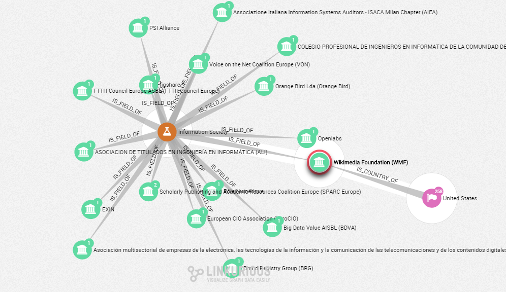
[caption id=”attachment_361” align=”aligncenter” width=”638”] Transparency Report Network: The Wikimedia Foundation and the lobbies specialized in the information society.[/caption]
By 2012, Sébastien Heymann, CEO of Linkurious, started working on a network visualization tool with the goal of expanding its use from niche, highly specialized industries. Heymann had already co-created Gephi, an interactive visualization and exploration platform for networks and complex systems, dynamic and hierarchical graphs, that was mostly used by researchers and data scientists.
“It’s paradoxical as we are more and more attuned to the networks around us but we still don’t have tools to understand them”, says Jean Villedieu, part of the Linkurious team. Now, the team has come up with a way to help businesses, investigative journalism organizations and governmental offices extract concrete insights from graphs.
Working closely with Neo Technology, the editor of Neo4j, Linkurious has recently launched Linkurious Enterprise, the first out-of-the-box graph visualization platform for graph databases. As the team claims, the product can be used for detecting fraud analysis and money laundering, network management, knowledge management and competitive intelligence and is already used by a few major organizations around the world, such as NASA, Cisco, Ebay, The French Ministry of Finances and The International Consortium of Investigative Journalists (ICIJ).
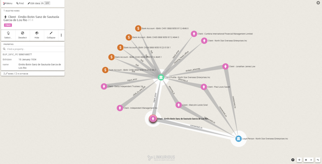
[caption id=”attachment_358” align=”aligncenter” width=”960”] “Swiss Leaks” Network: Emilio Botin, Former Executive Chairman of Spain’s Grupo Santander.[/caption]
Apart from big data technologies, such as Neo4j and Elasticsearch, the team uses linkurious.js, their own JS graph visualization toolkit for graph visualization. It has an open-source license, high performances and a plugin-like architecture (download it here).
Product and user research Users such as business analysts, data journalists or researchers can collaborate on visualizations and explore their large datasets easily via a web browser, and analyse graph data in a safe and collaborative way.
As for the product they’ve accomplished so far, they’ve focused on lean user research methods: “We apply a lean method to discover user needs, which involves conducting interviews and shipping features early. We had enough user feedback with the last Linkurious version to do a complete redesign of the user experience in a unified interface. This was a difficult challenge as we decided to make Linkurious a platform for multiple users instead of a single-user tool: we added many new features -export data, find shortest path, publish visualization, security, data entry, save visualization and filtering- while keeping the most important ones easily accessible. We still have a lot to do but it’s a great joy to see users happy to migrate to the last version” explains Heymann.
Use cases in Influence Mapping community The International Consortium of Investigative Journalists worked with Linkurious’s tool to investigate the “Swiss Leaks”, the analysis of around 60 thousand leaked files that provided details on HSBC’s clients and their bank accounts to bring to light a tax evasion scheme. This investigation revealed how the bank profited from doing business with tax dodgers and criminals around the world, helping over 100 000 customers hide $100bn in Switzerland. This year, the project was awarded with the “Investigation of the Year” Data Journalism Award, given by the Global Editors Network.
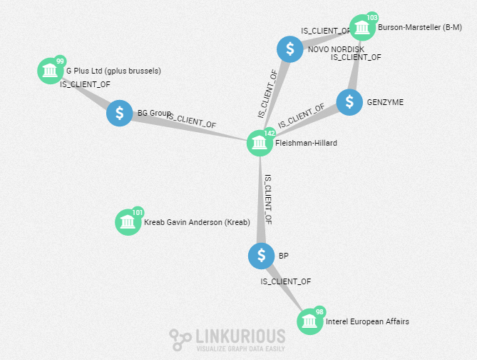
They’ve also worked with young journalists from AFP around drug-related crimes, a project inspired by Homicide Watch to learn more about the victims and their environment. Recently they’ve been exploring the relationships around the Transparency Register -set up by the European Union- to understand more about the influence of lobbies on policy making.
[caption id=”attachment_360” align=”aligncenter” width=”570”] Transparency Report Network: The 5 lobbies with the most clients in Europe and their common clients.[/caption]
Projects and tools to keep an eye on Investigative Dashboard “It’s exciting to see a project about network mapping which has the backing of Google. Definitely something to keep an eye out for”.
Tableau “We have a lot of admiration for them and the way they have popularized data visualization. We try to follow what they do and draw inspiration from them”.
Palantir “It’s also interesting to see what companies like Palantir are doing in terms of building tools to do large-scale data analysis”.
Connect! Linkurious is working hard to capture the feedback of its early customers on ways to improve. As of now, their priorities regarding the next product version include scalability, improvements on the data entry interface and compatibility with more data sources
“We’re excited by projects that give us the opportunity to: have a meaningful social impact, draw attention to the benefits of graph visualization and push the limits of our software.”
If you have a project that meets these characteristics, contact Likurious.