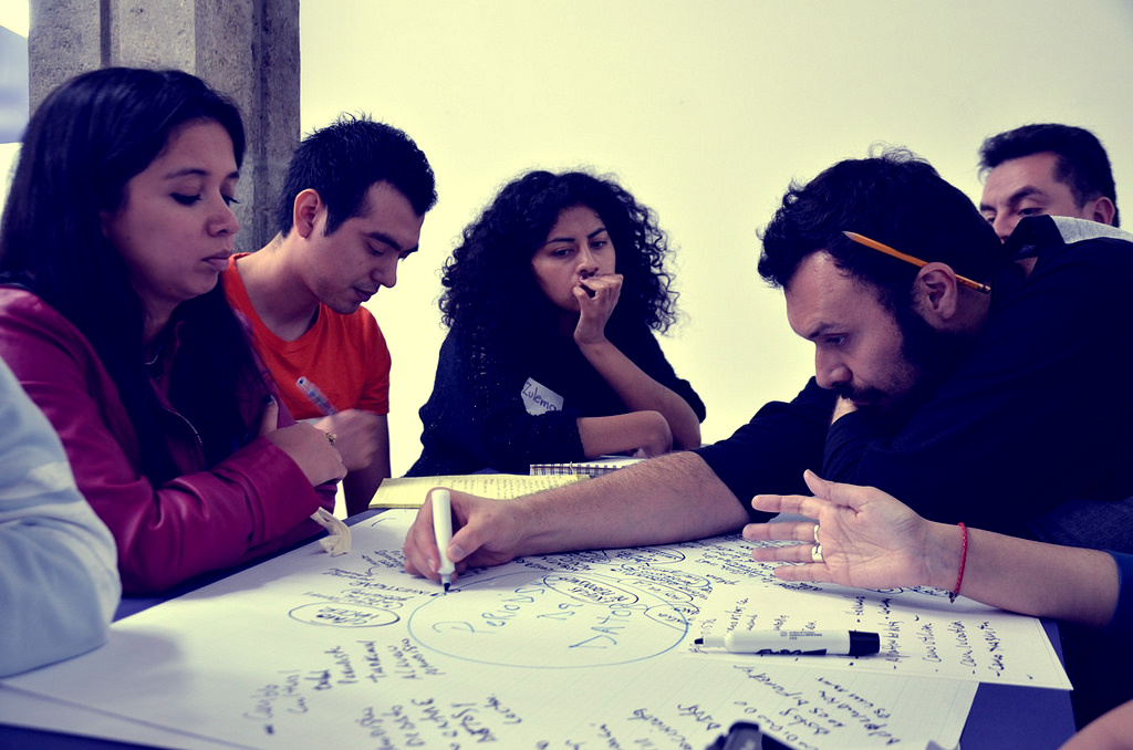
[caption id=”attachment_435” align=”aligncenter” width=”960”] via Abre Latam[/caption]
This Guest Post is from Andrés Snitcofsky (@rusosnith), graphic designer behind Cargografías, a visualization that shows the politicians careers in a easy-to-read timeline.
I had the opportunity to be part of Hacks/Hackers Media Party this past August (Buenos Aires, Argentina), as well as Abre Latam+Condatos in September (Santiago, Chile) and Open Government Partnership Summit in October in Mexico City. People attending these events are highly connected. The subjects they are addressing are similar, however, sometimes their end-users are different. These events are perfect for discussing who we address with our influence mapping tools and what should be accomplished.
Addressing the user needs In Media Party, most of the attendees were journalists and developers. Among other projects showcased, I shared the progress of Cargografias and joined Miguel Paz in his workshop about Node Mapper. Miguel gave a beginner tour for node mapping projects, and a user friendly, thorough explanation of node networks. This strategy was useful in terms of communicating and improving the understanding of concepts of “influence mapping” or “networks visualizations”. The activity was also useful to get in touch with the community around these tools, while keeping in mind their needs and what our tools should be accomplishing to satisfy them.
This key element was also relevant in Abre Latam, where I moderated a group discussion about data visualization. In this event, the gap between the tools and the actual users was noticeable. Although data visualization is being used in media and research, in some cases its user experience is too complex and finds difficulties coming up with a result that’s relevant for the end-user purposes: telling a story.
Based on the feedback I received during my talk at OGP Summit, entitled “Visualizing the Power of State & Influence Mapping”, I would say one way to go is to separate exploratory tools, used for experimentation, research and discovering information through network graphs, from those ones focused on editorial end-user visualizations. This last approach would probably be accompanied by a news piece or research annotations.
From my point of view, the best option would be to be able to work in both worlds, as I try to do with Cargografias, where you can explore the database, personalize and build the timeline you’d like to show, and then publish it. To accomplish this, we would have to know how to address users from both exploration and front-end visualization purposes.
The back-end discussion Among all of us working on influence mapping tools, there is an elephant in the room: How do we store the data, in which standard, and how do we share it with the rest (Open Data).
As any standardization discussion, it’s not an easy one as it continues. For instance, during these last months, I learned that PopIt tool, part of MySociety Poplus project, is no longer in active development. PopIt was useful for Cargografias at the time and now we find ourselves looking for a proper database/back-end for our tool.
On this note, I think Popolo could be a good standard to use for these kinds of tools, mostly because it’s flexible enough and because it’s still in development, so we can add features to it. Today, at Cargografias we are planning to continue working with Popolo, and we are also interested in learning more about the technical work Eduard Martín Borregón and the QuiénesQuién Wiki team have done so far.
As always, when choosing standards and databases, we may need to take a leap of faith. Even if it’s not the best, from my point of view we could all choose the same and help make it grow.
During this last OGP Summit, I asked developers, civic society activists and other hacktivists from all over the world to make a wish list:
What would you like the Back-End Data Standard Santa Claus would leave under our visualization tools Christmas tree?
This is the short list we came up with:
- Standardized "rates" of change, renovation and bondings of Politicians, Companies and Private people, to be able to compare cross country
- The ability to add public and private information about politicians
- Public employee performance
- Public employee record (Trials, campaigns, media participation, etc.)
- Government hierarchy
- Asset/Sworn declarations (Standardization)
- Education, Alumni, College connections
- Religious affiliations
- Foreign investments
- Parties and funding for campaigns and elections
- Connect public servants with the laws they pass
- Add family ties information into standards
- Discursive analysis/natural language
I invite all of our influence mapping community to make the same list. We may not all agree on the same database/schema/standard to use, but we can agree on the needs and priorities they need to tackle, and maybe have a few tools with different approaches but similar end results.
I urge us all to make a better effort on inviting other voices to these conversations. In my recent experience, there is a real need in influence mapping tools in Latin America, Africa as well as other developing countries. For some countries, an influence mapping visualization is vital in keeping an eye on our governments.