Influence Mapping February Roundup
Welcome again to our monthly roundup with stories around transparency and accountability, along with investigative journalism, studies and tools for the data practitioners.
Share your thoughts, needs, achievements and failures in our Google Group, hear about Influence Mapping projects in our Blog and join our Science Fair!
#STORIES AND THOUGHTS
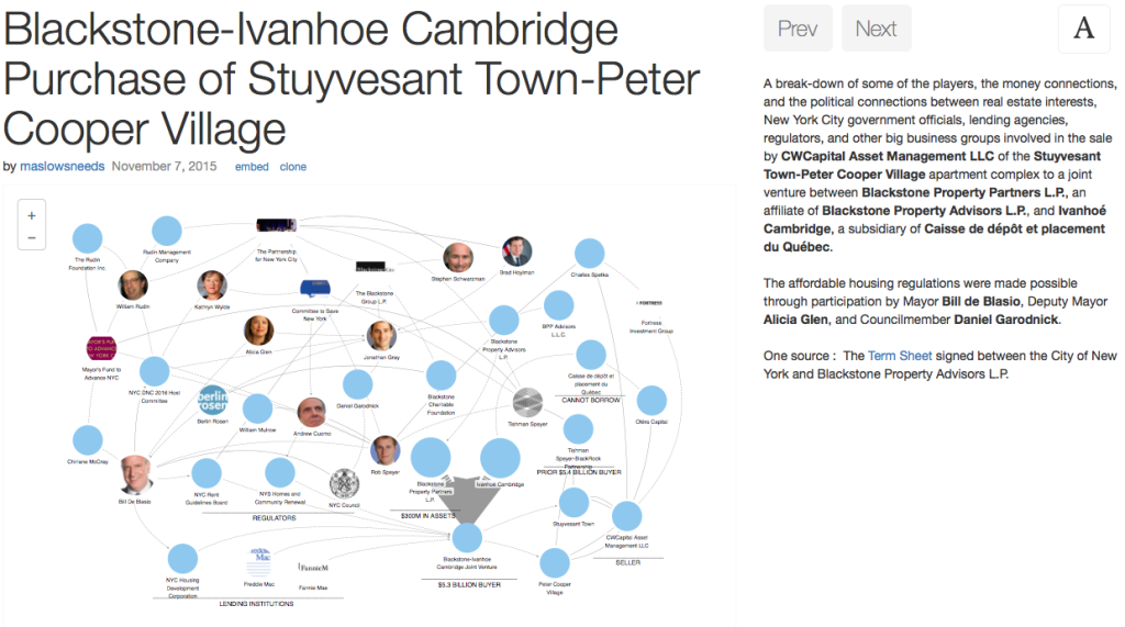
Create stories out of your network visualization with the New Oligrapher (Influence Mapping)
“The LittleSis team is currently working on a new version of its visual maps tool, Oligrapher. In collaboration with groups from the Influence Mapping network, this new version will be much more easily deployable by other projects and will facilitate storytelling through story maps”.
Sketching with Data Opens the Mind’s Eye (Giorgia Lupi, Medium)
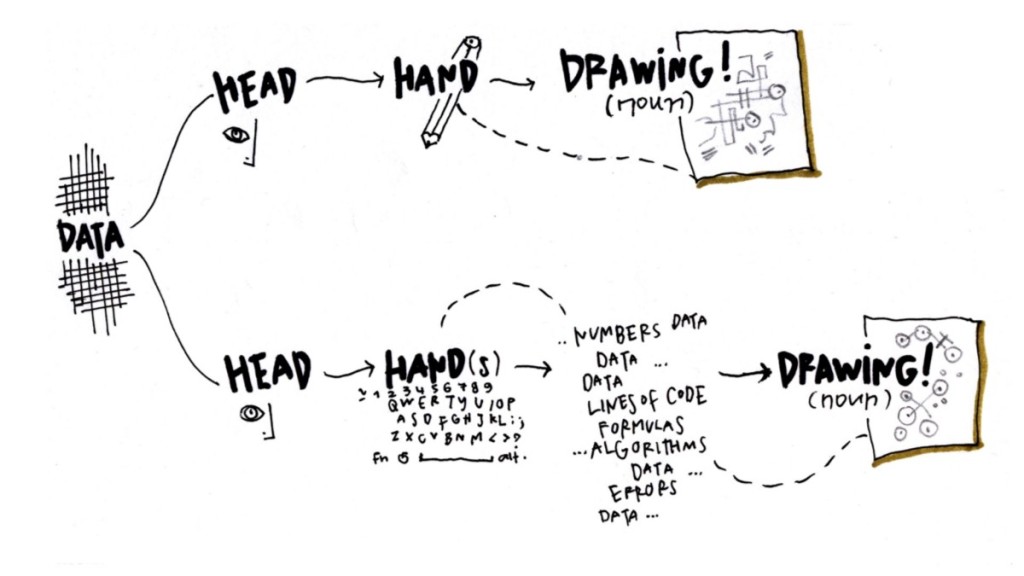
“The visual representation of information plays an increasingly critical role in every situation where data and quantitative information need to be translated into more digestible stories.”
OpenGov Voices: Why data journalism tries, and fails, to go global (Eva Constantaras, Sunlight Fundation)
“Transforming the legacy media’s messengers of breaking news into change agents for government accountability is a major challenge. It requires not just explaining the problem, but also exploring solutions.With this in mind, overcoming apathy will require not just a couple of data driven stories, but a structured journalism approach to covering governance consistently over time.”
What the global open data index shows about Africa (Stephen Abbott, Ijnet)
 Corrupt officials and criminal operators are brilliant at hiding their money and actions from public view. But there’s something we can do about it, says the team at Global Witness. It starts with closing loopholes.
Open data is changing the world in four ways (The Govlab)
Despite global commitments to and increasing enthusiasm for open data, little is actually known about its use and impact. What kinds of social and economic transformation has open data brought about, and what is its future potential? How—and under what circumstances—has it been most effective? How have open data practitioners mitigated risks and maximized social good?
Which country is the worst for rejecting asylum seekers? (Code for SouthAfrica)
"With the Syrian crisis putting asylum seekers high on the news agenda, the UN’s refugee agency has released a report on global forced displacement trends. And, as is often the case when it comes to being good at something bad, South Africa tops the tables for highest asylum rejection rate."
#RESOURCES
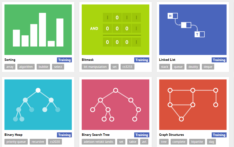
You can read all the theory in the world about priority queues and binary searches, but seeing these structures in action can really make it click. If you’re the sort of developer that learns better with pictures rather than words, check out VisuAlgo.
Research about incentivizing useful budget transparency (2015)
This research paper by Stephen Kosack works around what can international actors do to incentivize budget transparency that increases government accountability.
Transparency Register of the UE
The Transparency Register has been set up to answer core questions such as what interests are being pursued, by whom and with what budgets. The system is operated jointly by the European Parliament and the European Commission.
Github list of public data sets
This list of public data sources are collected and tidied from blogs, answers, and user responses. Most of the data sets listed below are free.
Global Corruption Report on Sport (2016)
At a time when football, tennis and track and field face big corruption crises Transparency International published its Global Corruption Report.
#TOOLS
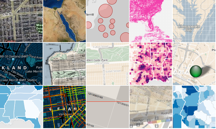
Polymaps, free JavaScript library for making interactive maps
Polymaps can load data at a full range of scales. Ideal for showing information from country level on down to states, cities, neighborhoods, and individual streets.
The open source Javascript graphing library that powers plotly
Any developer can now integrate Plotly’s library into their own applications. Plotly.js supports 20 chart types, including 3D plots, geographic maps, and statistical charts like density plots, histograms, box plots, and contour plots.
#MAP
This are the surprising connections between Davos elite (BBC)
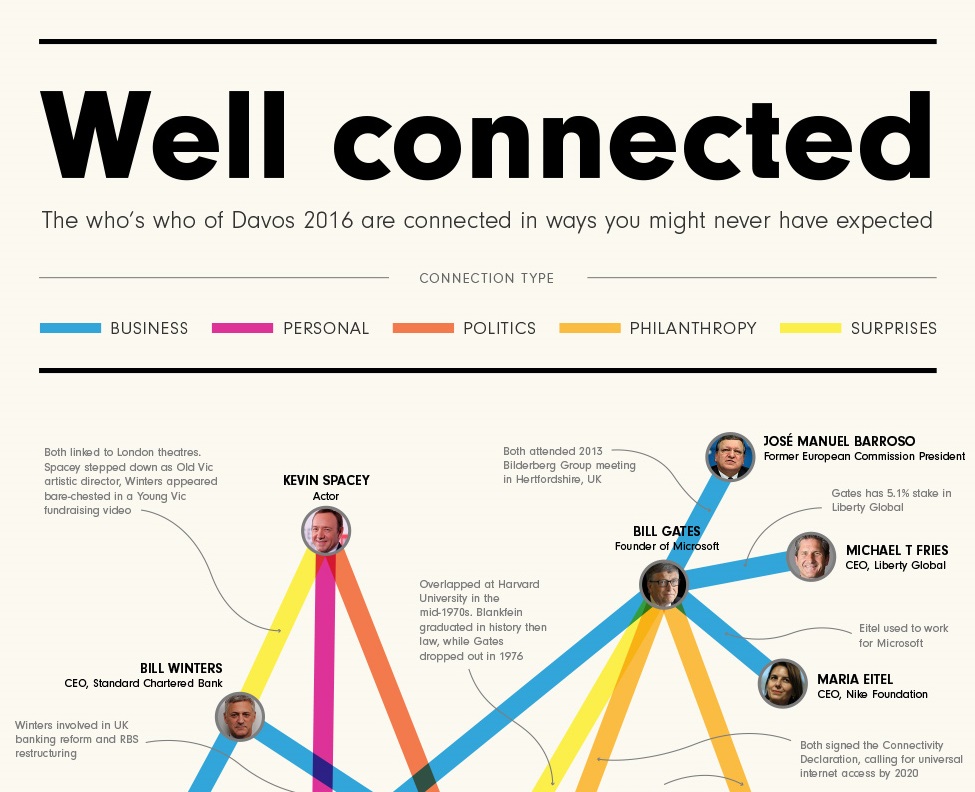
It’s no surprise that heads of states might be connected to major academics or chief executives. But then there are the connections that surprise. Kevin Spacey connected to a banking giant? Leonardo DiCaprio connected to Shimon Peres? The hidden links are everywhere.
#NEXT EVENTS
- #ogpuk: Civic participation workshop // Feb 25 (London, UK)
- Second annual International Data Responsibility Conference // Feb. 25-26 (The Hague, NL)
- I International Meeting of Data Journalism // Feb. 25-26 (Malaga, Spain)
- Hacks/Hackers Connect, New York // Feb. 26-27 (New York, NY)
- Hackers, Save The Date! // Feb 29 (Copenhagen, Denmark)
- Internet Freedom Festival // March 1-6 (Valencia, Spain)
- NYC's civic technology & open data conference // March 3 (New York, NY)
- Editors Lab: A Hackathon // March 3-4 (Sydney, Australia)
- International Open Data Hackaton. Open Data+You+Your Community+Your time zone. March 5
- Open Data Day, Ghana. // March 5
- Hacks/Hackers Colorado March Meetup // March 10 (Denver, CO)
- BBC #newsHACK Language Technology 2016 // March 15-16 (London, UK)
- Crypto Summit 2.0. // March 30, 2016 (San Francisco)
- Hack the Gender Gap: A Women’s IoT Hackathon at WVU // April 1-3, 2016 (Morgantown, WV)
- International Journalism Festival // April 6-10. Perugia, Italy
#APPLY
- School of Data’s 2016 Fellowship. Application deadline March 10, 2016.
- 2016 Ford-Mozilla Web Fellows program. Application deadline March 21, 2016.
- Stories on finance, lobbying, privacy or the environment, by Journalismfund.eu vow // Deadline: March 9th.
- Data Journalism Awards. The deadline for entries is April 10 2016
- ProPublica Summer Data Institute // Deadline: March 31st.
- impactAFRICA, Africa's largest fund for data-driven storytelling // Deadline: April 15
- Code for Nigeria is looking for a digital journalist and strategist. // Application deadline: February 29. Lagos (Nigeria)
